


Demitro – Bold Geometric Sans Serif Fonts Q4N76ZB
Demitro – Bold Geometric Sans Serif Fonts Q4N76ZB
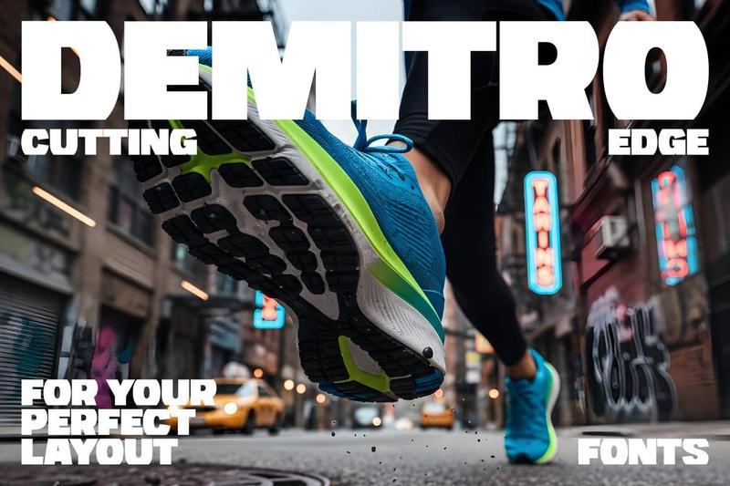
**Redefining the grid. Demitro** is not just another bold sans-serif; it is a precision-engineered display font designed for designers who demand structure. By meticulously shearing the top and bottom of traditional letterforms, Demitro transforms standard characters into hyper-stable, squared-off blocks that command attention.
The result? A typeface that feels less like writing and more like architecture.
The Concept: Form Meets Function
While the DNA of Demitro is rooted in the reliability of a classic heavy sans, its execution is purely modern. The “flat-cut” philosophy ensures that every line of text creates a perfectly aligned horizontal boundary. This unique geometric profile makes it a “cheat code” for achieving professional, balanced layouts with zero effort.
**Why Demitro is a Layout Essential:**
* **Perfect Compositions**: The squared-off tops and bottoms create natural “snap-to” points, making it ideal for tight leading and interlocking text blocks.
* **Branding with an Edge**: It provides the impact of a custom-designed logo straight out of the box. Its silhouette is unmistakable, giving brands a sense of permanence and strength.
* **Maximum Versatility**: Though it carries a unique “cut” aesthetic, it retains the high legibility of a basic bold font, making it suitable for everything from high-fashion editorial to heavy-duty sports branding.
**Ideal For:**
* **Impactful Headlines**: Stop the scroll with headers that feel heavy and grounded.
* **Identity Design**: Create logos that look custom-lettered and structurally sound.
**Elevate your design toolkit today. Don’t settle for “basic” when you can have a font that defines the layout for you. Experience the perfect balance of bold presence and geometric precision.**
**[Download Demitro Font Now]**
What’s Inside:
* Demitro-Regular.otf
* Demitro-Regular.ttf
* demitro-regular-webfont.woff
* demitro-regular-webfont.woff2